Friday, 16 December 2011
The importance of lighting
The key light is the main source of light and is key to the whole set up, it is angled 45 degrees from the camera, so it is not faced on and it won't look as well defined, so at the 45 degree angle she looks well defined as wrapped around the face, apart from a few shadows, which is where you use the fill light to get rid of them.
The fill light is also placed at a 45 degree angle from the camera, however is opposite from the key light. The fill light is less intense than the key light, you can do this by using a lamp, or simply moving the light further away as this effects the light tensity, also you can use a density gell. Using key light and fill light creates an even light around the subjects face and helps them blend into the background.
The back light is used to make them stand out of the background. The light is placed behind them but not at the camera, and this creates a rim of light behind their shoulders and their head, to make them stand out of the back ground, so in the end once used all 3 together, the subject looks really good.
Vampires; examples of vampire make-up/costume
Make-up we are wanting to use:
- fake blood
- white powder/face make up
- fake teeth
- white contact lensers
- mascara
- eye liner
This is the kind of make-up we are wanting to use because it will create the vampire look (pale faces, fake teeth, lots of blood, bizzare eye colours).
All these are out of the ordinary to humans, so it creates the effect that they are different.
To create this effect we have to apply white face make-up, fake blood, fake teeth which we have collected from our homes from halloween.
With clothing, vampires are to wear quite casual clothing for example, plain t-shirts, trousers (applied to both women and male) you may have seen this kind of clothing from films like Twilight and Drama's like True Blood.
We are wanting to dress our vampires in dark clothing to create the effect of them being quite dull and the colour may reflect on the weather/day/night. In our case night time.
Friday, 9 December 2011
MOVING PICTURES (STORYBOARDING) THE SIXTH SENSE
The purpose of storyboarding is to use it so you know what you will be doing throughout filming. When coming to filming it is less stressful and more organised if everything is planned out step by step and you will walk in to filming knowing what your about to do such as what is happening in each shot, angles and how long each shot lasts. When story boarding all your concentration goes into it, so ideas are coming constantly and different ways of thinking creates these ideas.
To show lighting in storyboarding you shade the areas darker where you are wanting darker lighting and leave it white where light lighting is needed/wanted. When creating a storyboard you are the camera, so in the storyboard box you will have to draw what you are wanting in that shot and you draw the image at the angle you want. To show camera movement you use arrows drawn in the direction it will be moving.
Ideas for film- Narrative
http://www.youtube.com/watch?v=BPlq6tI7Zvc
Here shows the bite given to the victim by the vampire, we like the shots used to show the bite and to then show the facial expressions given by the victim. There are close-ups of eyes, teeth etc which are the kind of shots we would like to use to show the transformation of our victim becoming a vampire. We would like to use the pace of the different shots in this but not all the way through, we will slow shots down to give a better understanding of what is happening.
http://www.youtube.com/watch?v=reRRAEVHq8E
Here is the trailer of Let Me In, we are wanting to use a female as the vampire this is because you hardly see female vampire in films (it is very rare), also what we had taken on board is the clothing she is wearing, its ordinary/normal so noone thinks shes strange/different, apart from one small thing... she wears no shoes, however we are not wanting to use this, we want our vampires and victim to be in dressed in casual clothing.
In our film we want the girl who gets taken by vampires to be totally normal at the beginning like you see with the girl from Let Me In, but as time goes on you start to see who she really is under that inoccent mask.
http://www.youtube.com/watch?v=wHf6Th-E3kE
The lighting in this clip from 28 weeks later, is very dull, which throughtout our film is what we are wanting also you see in this clip that they are in one room which we would like our film to be based in just one small room thats not very appealing. You can feel the tension in the room and just from this clip you can get a jist of the characters (who may have the stronger personalities) which in our film we would like to create a bond with our victim to the audience so they feel what she is going through.
Thursday, 8 December 2011
Art Of The Title
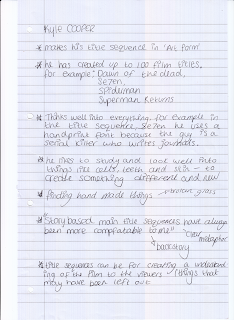
We chose this particular title sequence because of the type of images and shot types used. We like how the shot types are close-ups, master shots and canted. There is a variety of shots and we would like to use many different shots this is because we think it is more effective. The images shown shows the location, characters and props. This gives you an instant idea what the film may be about.
Monday, 5 December 2011
Friday, 2 December 2011
Title Sequence Template
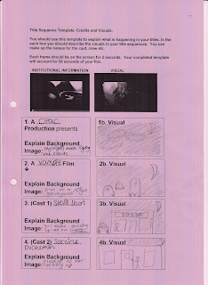
We made some changes to our title sequence, such as we didn't have her in a car or at the local shop, as we just had he walking like most teenages on her phone, and i think watching her walk creates a sense of reality like shes just a normal teenage girl, so it will be even more sad for the audience when she dies and scary. We kept the graveyard and the bite scene and her kneeling by a grave.
Thursday, 1 December 2011
Chariss and Katie Title Idea Grids
Here are our own grids for title ideas, we have images that we thought would relate to vampire films.
We have based the first grid on Seven as it is more story based, like someone's day to day life like cars driving past and a man walking a dog.
We have based the second grid on True Blood as, in their title sequences they have lots of different images based on the genre, which we have also done, as ours is vampire and we have put image like bats and sharp vampire teeth with blood, so it relates to our film.
Subscribe to:
Comments (Atom)


