When marking our film, i would mark it a middle level 3.
The reasons being, we produced a story-line appropriate for the genre of the film and when researching into many different vampire films, we found out the appropriate target audience, so we new who to aim our film at and what to include in it to make it successful to the target audience.
We also used our titles and sound well to fit with the genre of our film, we used a jagged font that is popular when watching vampire film, however we could have changed the colour to red to make it fit better with the genre, but still i think our white font worked well with our title sequence. Also when creating our sound, we learnt how to use garageband to create a piece of music. We also researched into sounds/songs that are commonly used in horror films, this then gave us a rough idea of what sounds we wanted to include.
When editing, we found it very easy as we stuck to our storyboard and shot list, so we new exactly what shot was needed and the length of the shot.
Friday, 4 May 2012

Friday, 27 April 2012
marking my film in relation to the mark scheme
sound
mise en scene
genre
editing
camera work
lighting
I think this was a really good film and the sound went well with it and changed with the different clips , such as when it showed the name of their film the music changed and was good a creepy. Also the begining sound where it sounds like a news report, thats interesting and different and makes it seem more real, also the sound such as voice when he shouts help, doesn't sound fuzzy or anything so its good as sounds professional. The mis en scene used was very good as they had all sorts of props like a saw and masks and pictures and blood splattered everywhere and such which shows what genre it is with all the blood, and murder equipment. The editing done is really good as it flows really well, as you don't notice any jump shots in it and they follow all the rules really good, like the rule of thirds and such. They had a lot of good camera shots like the tracking shot at the begining of the bath tub such so there's a lot of variety and theres a lot of them, so there is many long shots and such so is more interesting. THe lighting was good as clear and could see everything, but not too bright and happy, as that wouldn't seem as much as a horror, as it is quite dull in most, which creates a good atmosphere.
mise en scene
genre
editing
camera work
lighting
I think this was a really good film and the sound went well with it and changed with the different clips , such as when it showed the name of their film the music changed and was good a creepy. Also the begining sound where it sounds like a news report, thats interesting and different and makes it seem more real, also the sound such as voice when he shouts help, doesn't sound fuzzy or anything so its good as sounds professional. The mis en scene used was very good as they had all sorts of props like a saw and masks and pictures and blood splattered everywhere and such which shows what genre it is with all the blood, and murder equipment. The editing done is really good as it flows really well, as you don't notice any jump shots in it and they follow all the rules really good, like the rule of thirds and such. They had a lot of good camera shots like the tracking shot at the begining of the bath tub such so there's a lot of variety and theres a lot of them, so there is many long shots and such so is more interesting. THe lighting was good as clear and could see everything, but not too bright and happy, as that wouldn't seem as much as a horror, as it is quite dull in most, which creates a good atmosphere.
Thursday, 26 April 2012

Question 7: Looking back at your preliminary task, what do you feel you have learnt in the progression from it to the full product?
Here is my video where i have discussed all of the video's we have filmed and posted onto blogger since the very beginging of my a.s year at bilborough college right up to our final horror film.
Thursday, 19 April 2012
Monday, 16 April 2012
Production Horror Film Marking List Feedback
The two sheets below are our marking criteria's from groups in our class.

This group gave us a low level 3 and we are happy with this grade because this is what grade we was hoping we would achieve. They understood the genre of the film which is a very good sign because this is what sums up our whole film and they have to know what is going on.
Overall they said sound and camera was very well used and edited and also costume and make-up was well used. We were happy with the feedback we got.

This group gave us a high level 3 and we are happy with the feedback given. They mention that we should have used a different colour for our titles but the reason for choosing white is so that the titles stand out because of the title sequence being quite dark we didn't want to used a dark colour that would not be as noticeable, but we know that white is not as relatable to a horror film.
They also mention that the more tense scenes, music should have more variety when it comes to this and we learn from our mistakes and will take this on board and improve the music.
Friday, 23 March 2012


Chariss- Question 5 extended
Here is our audience feedback on what they thought of how film and how we could improve it.


This feedback sheet was given us before we completed the whole of our film. They say our mise en scene was 'all good' and would consider watching the rest of our film. They gave us a mark of 45/60, i would of liked more feedback to see how we could improve to up our marks.

In this feedback sheet they comment on our camera work and how we have a good variety of shots but said some of our shots were to long, we took this on board and changed this. They also said the genre of our film was clear which is good because we dont want our audience being confused about this.
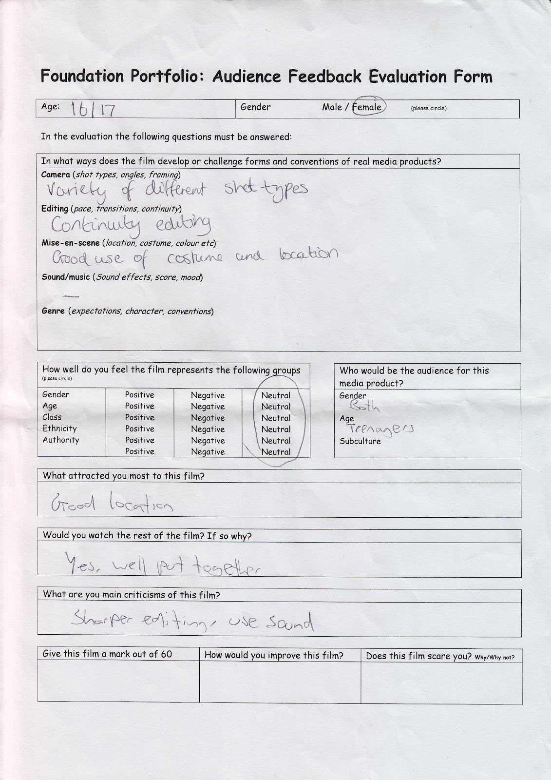
This feedback sheet they also said we have a good variety of shots and made good use of our costume and location.
We are happy with the good feedback and our bad feedback such as our sound and having some long shots we will take on board and change to make out film better.
Thursday, 22 March 2012
Chariss Lee Question 4
No film is for everyone, so it is important to know and find out who your target audience may be; this is because you want your film to succeed and by aiming it at people who are not interested is not the way to do it.
Here is the trailer from Fright Night.
It is very common for the vampire to be male and any age above 18 and in this film they have done exact that and have not challenged any stereotypes. By using a male as the villain makes a more tense/intimidating feeling when it comes to the biting of his victims because males are known to be much stronger and faster than women. However his victims are both females and males all ages, which is also common in vampire films such as 'Let Me In' and 'Twilight'.
The main characters in this film are Teenagers, so it would make sense the film would be aimed at teenagers because they relate by their age and teenagers are interested in other teenagers lives. This film could be aimed at both genders because of the film being a thriller.
Their class is all the same, they live in a nice neighbourhood and from what is shown their parents are working class.
When in the classroom you can see a variety of races, however the main characters in the film are all white, so the target audience for this film may be teenagers, males and females from the white population.
For the film i am creating, our target audience when researching was males aged 18-29. If i was to say who i feel would be our target audience, it would be both genders aged 18 and above, this is because the main characters in our film, both victim and villain are female and because of the amount of gore that will be shown in the rest of our film this is what would draw the males to come see our film.
Friday, 9 March 2012
Question 3 - Katie Smyth - film poster ideas
Distribution
Distribution is getting the product out to its customers/audiences, so it is seen and known to the public, which gets more people viewing the film. This is done in many ways such as:
- Posters
- Trailers - at the beginning of other films in the cinema or during TV adverts.
- Film festivals
- Internet advertising
- magazines / newspapers
- Chat shows
- Social sites
- radios (e.g interviews)
Here i have researched 2 independent production companies and 2 major production companies, and i have been comparing the difference between them and how they distribute films.

House of the dead was by Brightlight pictures, which is a major production company as uses artisan entertainment distribution company, so this is likely to have more publicity and viewers as it has major distribution company, so will have good distribution of this film.

Mirrors is produced from a major media institution, regency enterprises. 20th century fox was the distribution company of mirrors, which is a major corporation, which is likely why mirrors is a very well known film.

nightmare is a hammers film productions film, which is an independent film production company. For nightmare the distribution companies were rank (in the uk) and universal (in the us), rank defunct in 1995 and universal is no longer independent it is owned by comcast.
There is a big deifference compared to major film production companies and independent, as you can see that the major company's have made a lot more films that the independent ones, the film from the independent production company hammers, is very old and not well known, as now days its more like likely to know of a film or go see a film from one of the major production companies. however they are both similar as they both distribute posters and trailers for their film.
Film festivals
Film festivals are a great way to distribute your film, and get it well known by the public.
Here is my production company logo:

Here is universal production company's logo (a competitor):

They are both similar as have both black backgrounds, which i think makes the images clearer and look more professional. Our's is slightly a bit bluryer where we have edited it on photoshop, as there is very clear. We both have our production company name in the centre of the image. Their's is a lot more general, so could be used on different genre films, where as our's is obviously for vampire films as you can tell by the image, so wouldn't be able to use it in other types of films. Their's is also more colour full, but mine works well for a horror film with the colours and such. They both have clear writing that goes with the image well.
Here are some sample posters that helped us with film idea's for our film. Heres one horizontal and one vertical, but in the end we went with the horizontal:


Here is our finished film poster:

Here i have included the name of our film when our film will becoming our in the cinema, also our film will be out on dvd in january the 4th. Also in the poster it includes our logo at the bottom right with our film productions company on it.
Here is a trailer that would be similar to ours, as the main characters are teenagers like ours, and the victim is a vulnerable teenage girl, which a vampire is after.
Chariss Lee- Question Three- film festival Nottingham
Local promotion is a great way to get started in the film industry and get your work/name noticed and it is a great opportunity for anyone to be involved. This film festival was shown in a independent cinema in Nottingham. You always have to start at the bottom and work your way up and this is a great way to do so.
Friday, 24 February 2012
First Shoot and first edit
We think we could have done a lot better on our first shoot, by shooting more shots such as close ups.
question 3- Chariss Lee- Film poster ideas
Here are a number of posters/dvd covers from horror films, this is to give me many ideas when it come to creating my poster for my film.


These posters give you a sense that they are out to get someone/everyone and shows their is a particular victim. The images shown, show the genre of the film and also the colours used help you identify the genre.


These posters show death of people and a sense of mystery is given out by a head that is no longer attached to the body and teeth that are no longer attached to someone's gums- How did they get like this? These sum up a little about the film but with a image that makes people question what the film may be about.

This is a poster made for the film 'Let Me In' it shows the to main characters and the title of the film and many taglines. The title of the film is written in white to go with there theme colours in the poster, the title is also in capital letters and placed in the middle of the poster. This is what you see straight away. Below the title are many taglines which give you a rough idea of what the film may intail.

This poster has a number of images in it which staright away shows the audience what it is about. The title of the film is written in capitals and the colour red. The colour red relates to the title of the film 'Blood' (the colour of blood).

This poster draws you straight to the title and image as they both blend in together. The title is written in a bold font and the colours match the theme running through the poster.
question 3- chariss lee- part 1
This film was distributed by the production company 'Lions Gate'. Lion Gate is a major company and these are the ways they distribute their films.
In the clip shown above, it uses a lot of natural lighting, which lightens up the old grim rooms and puts a bit of life into them. By the look of the rooms, its a releif to have natural light in them because it must be a horrible experience to be in them alone at night with no light.
In the clip there is a shot showing a variety of tools and them being put to use, but on a humans toe, which shows the audience the film will be quite disturbing to many human beings.

In the clip shown above, it uses a lot of natural lighting, which lightens up the old grim rooms and puts a bit of life into them. By the look of the rooms, its a releif to have natural light in them because it must be a horrible experience to be in them alone at night with no light.
In the clip there is a shot showing a variety of tools and them being put to use, but on a humans toe, which shows the audience the film will be quite disturbing to many human beings.

It may be unusual to use orange, yellow and gold on the front cover of 'Hostel' because these kind of colours represent wealth, joy, happiness, attraction, warmth of the sun, however black represents death, power and evil. But when looking at the cover you know straight away its not some kind of fairytale and that it is a horror/thriller by the image shown but also the colours create a dark threatening effect on the viewer.
The font is very rough around the edges and with it being in capitals it makes it title clear and make sures it stands out by the font and colour used.
Chariss Lee- Question 3- Part 1
Black and blue are a Independent Film production and below are some examples of how they distribute their films.
Trailers are common when wanting to advertise a film and their aim is to draw people in and make them want to see the film.

Trailers are common when wanting to advertise a film and their aim is to draw people in and make them want to see the film.

Here is the dvd cover of 'Stalker' the colours used are similar to the colours used in the advertisement of 'Hostel' (orange, yellows and blacks) this gives off the effect that the film is not a happy romantic comedy and the colours shows the film is some kind of horror/thriller and the images shown also identify it is that kind of genre.
With the colours being quite dull it does not draw me in but it creates a great understanding of what type of film it is.
Thursday, 23 February 2012
Chariss Lee- Question Three
Distribution means when you are ready to get your film out there (its ready to be seen by the public). For example when distributing your film you will create posters and trailers that will then be shown via youtube etc and posters/billboards will be put up around cities/busy areas to make sure it is seen.
When distributing my film, trailers will be shown in cinema's, via youtube and on TV also posters would put up in Media stores such as HMV etc and billboards will be put up in busy Cities.


Other ways of distributing films: you may show your trailer at film festivals. Interviews that may be put on the radio, in magazines and on television. Trailer/posters advertised on Facebook (big social sites).

Hammer Film Productions is a film production company based in the United Kingdom. Hammer is a independent company and below is a example of how they distribute their films.
Trailers are very popular when it come to distributing films. It gives the audience a rough idea of what the film is about and if they are intrigued and are drawn in by this trailer they are more likely to go see the film in cinemas or buy it on dvd.
This trailer shows the female being the victim and the male being the villain and how easily fooled she is by him because she thinks he is a nice genuine guy. With the voice over being a male with a deep clear understanding voice it helps sum up the film and creates a sense that the film is packed full of drama.
When distributing my film, trailers will be shown in cinema's, via youtube and on TV also posters would put up in Media stores such as HMV etc and billboards will be put up in busy Cities.

Above is a example of a way of distributing a film- Billboards.

Trailer distributed on Youtube.
Other ways of distributing films: you may show your trailer at film festivals. Interviews that may be put on the radio, in magazines and on television. Trailer/posters advertised on Facebook (big social sites).

Youtube offers many opportunities for students to let their projects go to use and the prize at the end of this opens up many more opportunities for students.
Hammer Film Productions is a film production company based in the United Kingdom. Hammer is a independent company and below is a example of how they distribute their films.
Trailers are very popular when it come to distributing films. It gives the audience a rough idea of what the film is about and if they are intrigued and are drawn in by this trailer they are more likely to go see the film in cinemas or buy it on dvd.
This trailer shows the female being the victim and the male being the villain and how easily fooled she is by him because she thinks he is a nice genuine guy. With the voice over being a male with a deep clear understanding voice it helps sum up the film and creates a sense that the film is packed full of drama.

The image on this poster gives a rough idea of the film/location and shows it is a thriller.
The colours of this poster give out the impression that there may be a mystery, death, some sort of evil in the film.
The font of the title is bold and one of the main things that stand out in the poster.
Posters are made to advertise and draw you in to see the film.
This poster wouldn't catch my eye but the trailer does.
Friday, 10 February 2012
Evaluation update
Chariss:
Question 1
Question 2
Question 4
Question 5
To be done- Question 3
Katie:
Question 1
Question 5
Question 1
Question 2
Question 4
Question 5
To be done- Question 3
Katie:
Question 1
Question 5
Subscribe to:
Posts (Atom)